align-content in CSS Flexbox – How to Layout Flex Lines
align-content specify how browsers should position a flexible container’s lines along the flexbox’s cross-axis.
The align-content property accepts the following values:
stretchflex-startcenterflex-endspace-betweenspace-aroundspace-evenly
Let’s discuss the seven values.
What Is align-content: stretch in CSS Flexbox?
Section titled “What Is align-content: stretch in CSS Flexbox?”stretch is align-content’s default value. It stretches the flexible container’s lines to fill the flexbox’s cross-axis.
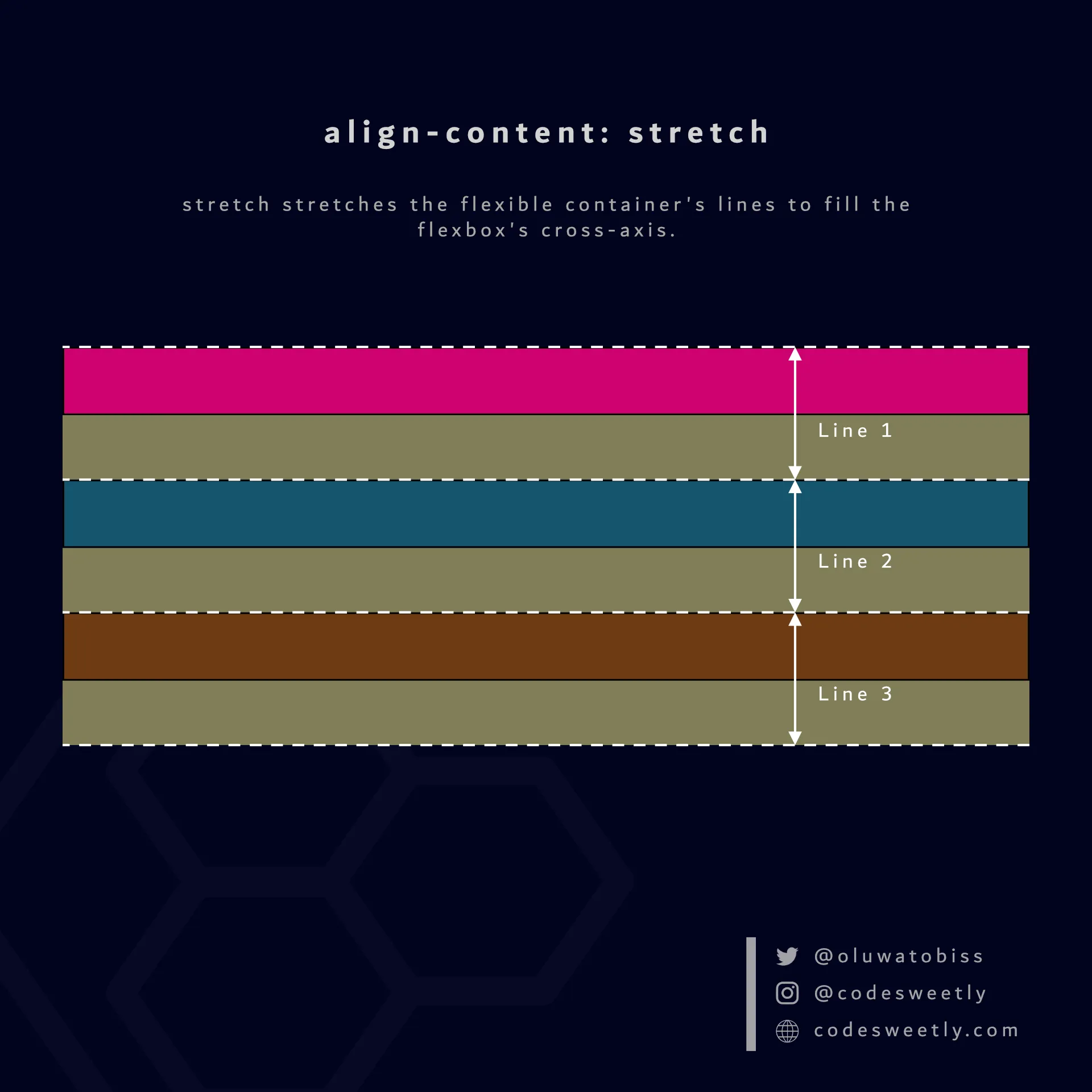
align-content’s stretch value stretches flexbox’s lines to fill the container’s cross-axis
Here’s an example:
section {  display: flex;  flex-wrap: wrap;  align-content: stretch;  background-color: orange;  margin: 10px;  width: 90px;  height: 500px;}
div { border: 1px solid black; background-color: purple; color: white; width: 30px; height: 30px; padding: 10px; border-radius: 5px;}<section> <div>1</div> <div>2</div> <div>3</div> <div>4</div></section>The snippet above used the stretch value to stretch the flexbox’s lines to fill the <section>’s cross-axis.
What Is align-content: flex-start in CSS Flexbox?
Section titled “What Is align-content: flex-start in CSS Flexbox?”flex-start aligns a flexible container’s lines with the cross-start edge of the flexbox’s cross-axis.
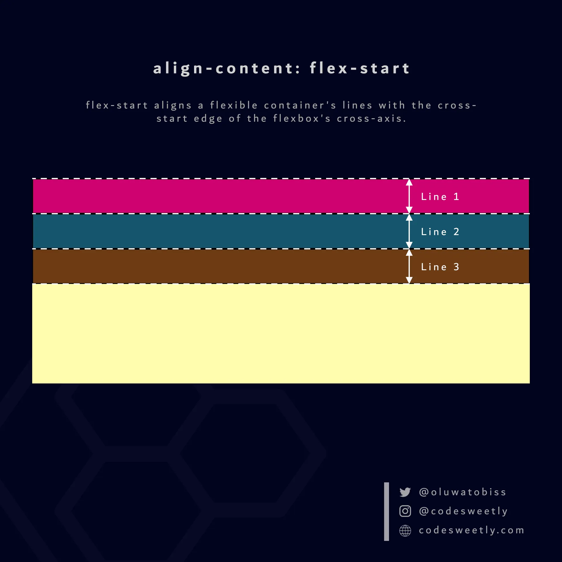
align-content’s flex-start value aligns flexbox’s lines to the container’s cross-start edge
Here’s an example:
section {  display: flex;  flex-wrap: wrap;  align-content: flex-start;  background-color: orange;  margin: 10px;  width: 90px;  height: 500px;}
div { border: 1px solid black; background-color: purple; color: white; width: 30px; height: 30px; padding: 10px; border-radius: 5px;}<section> <div>1</div> <div>2</div> <div>3</div> <div>4</div></section>The snippet above used the flex-start value to align the flexbox’s lines to the cross-start edge of the <section>’s cross-axis.
What Is align-content: center in CSS Flexbox?
Section titled “What Is align-content: center in CSS Flexbox?”center aligns a flexible container’s lines to the center of the flexbox’s cross-axis.
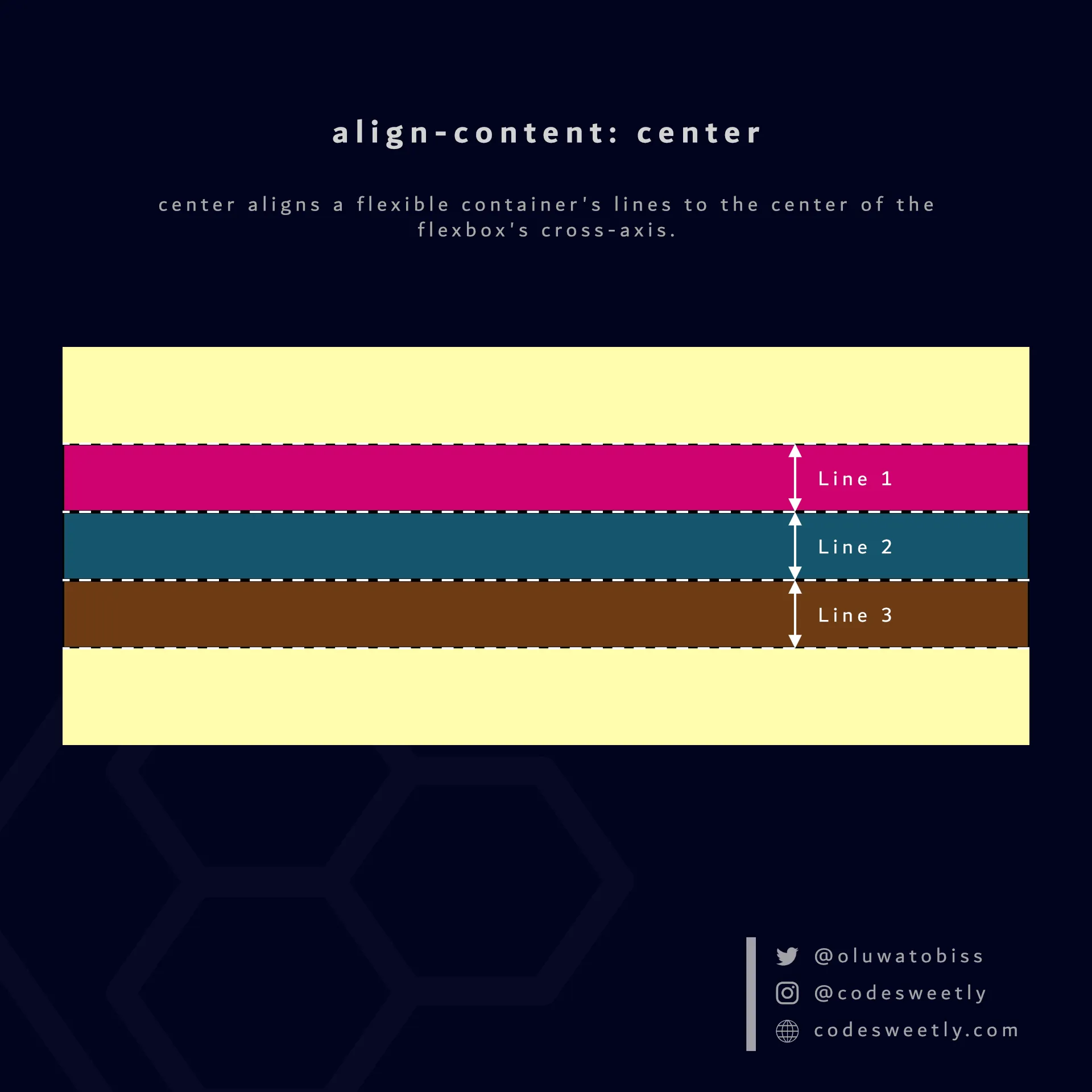
align-content center value aligns flexbox’s lines to the center of the container’s cross-axis
Here’s an example:
section {  display: flex;  flex-wrap: wrap;  align-content: center;  background-color: orange;  margin: 10px;  width: 90px;  height: 500px;}
div { border: 1px solid black; background-color: purple; color: white; width: 30px; height: 30px; padding: 10px; border-radius: 5px;}<section> <div>1</div> <div>2</div> <div>3</div> <div>4</div></section>We used the center value to align the flexbox’s lines to the center of the <section>’s cross-axis.
What Is align-content: flex-end in CSS Flexbox?
Section titled “What Is align-content: flex-end in CSS Flexbox?”flex-end aligns a flexible container’s lines with the cross-end edge of the flexbox’s cross-axis.
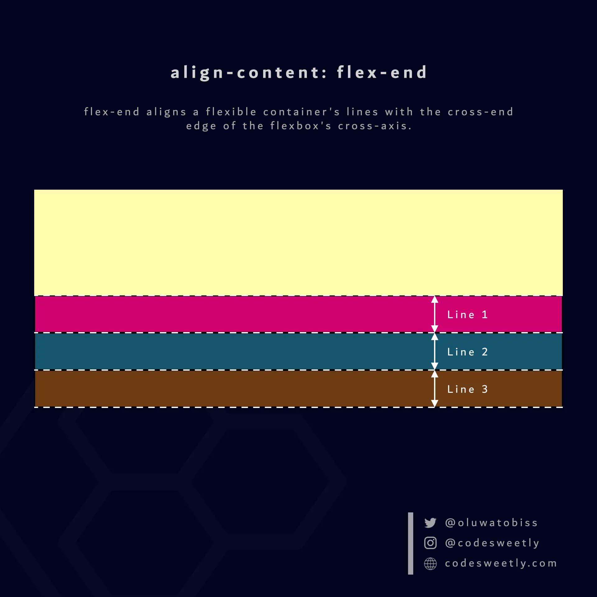
align-content’s flex-end value aligns flexbox’s lines to the container’s cross-end edge
Here’s an example:
section {  display: flex;  flex-wrap: wrap;  align-content: flex-end;  background-color: orange;  margin: 10px;  width: 90px;  height: 500px;}
div { border: 1px solid black; background-color: purple; color: white; width: 30px; height: 30px; padding: 10px; border-radius: 5px;}<section> <div>1</div> <div>2</div> <div>3</div> <div>4</div></section>We used the flex-end value to align the flexbox’s lines to the cross-end edge of the <section>’s cross-axis.
What Is align-content: space-between in CSS Flexbox?
Section titled “What Is align-content: space-between in CSS Flexbox?”space-between does the following:
- It aligns the flexbox’s first line with the main-start edge of the flexible container’s main axis.
- It aligns the flexbox’s last line with the main-end side of the flexible container’s main axis.
- It creates equal spacing between each pair of lines between the first and last line.
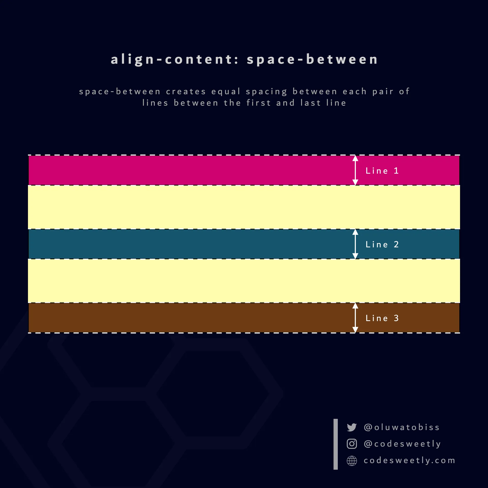
align-content’s space-between value creates equal spacing between each pair of lines between the first and last line
Here’s an example:
section {  display: flex;  flex-wrap: wrap;  align-content: space-between;  background-color: orange;  margin: 10px;  width: 90px;  height: 500px;}
div { border: 1px solid black; background-color: purple; color: white; width: 30px; height: 30px; padding: 10px; border-radius: 5px;}<section> <div>1</div> <div>2</div> <div>3</div> <div>4</div></section>The snippet above used the space-between value to create equal spacing between each pair of lines between the first and last line.
What Is align-content: space-around in CSS Flexbox?
Section titled “What Is align-content: space-around in CSS Flexbox?”space-around assigns equal spacing to each side of a flexible container’s lines.
Therefore, the space before the first line and after the last one is half the width of the space between each pair of lines.
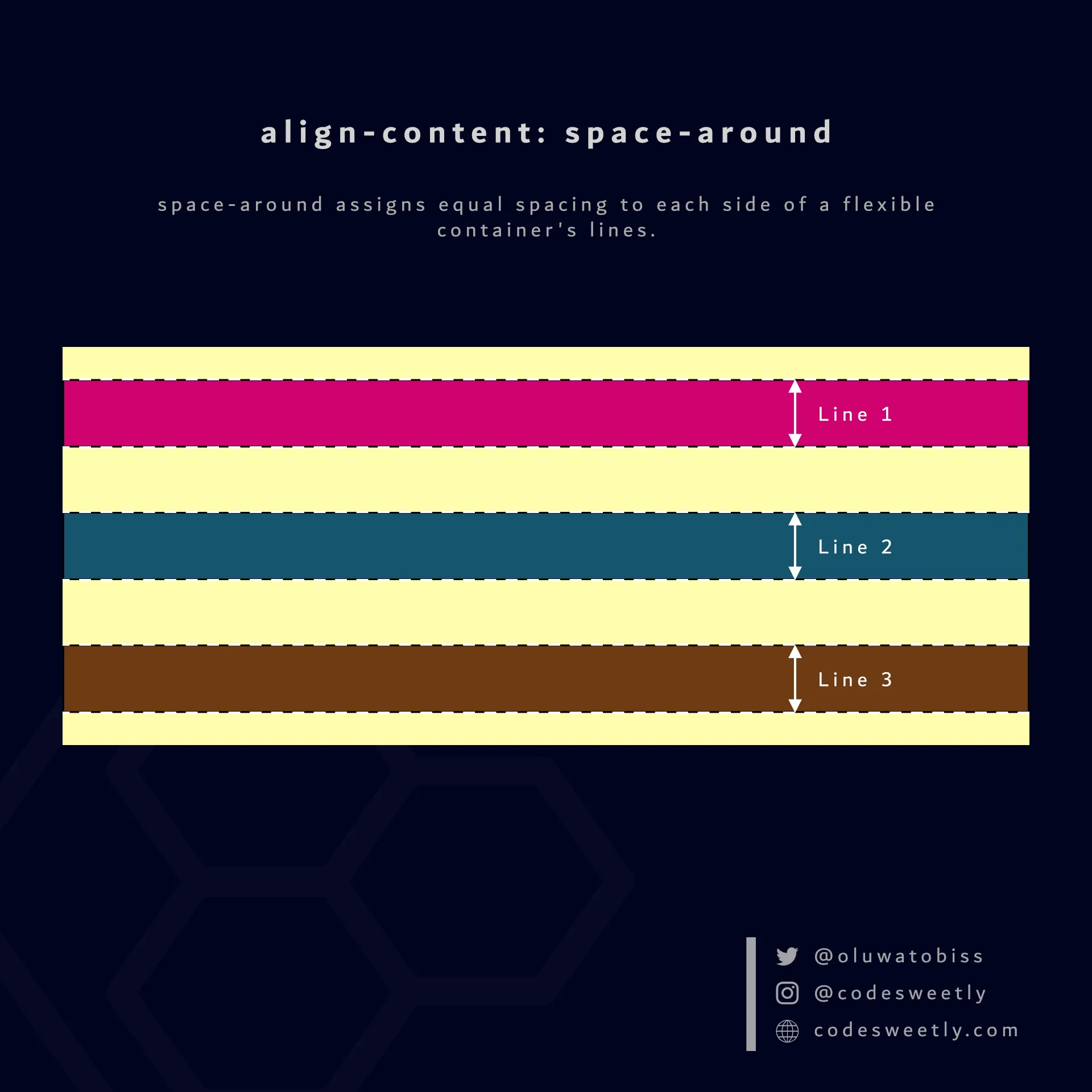
align-content’s space-around value assigns equal spacing to each side of a flexbox’s lines
Here’s an example:
section {  display: flex;  flex-wrap: wrap;  align-content: space-around;  background-color: orange;  margin: 10px;  width: 90px;  height: 500px;}
div { border: 1px solid black; background-color: purple; color: white; width: 30px; height: 30px; padding: 10px; border-radius: 5px;}<section> <div>1</div> <div>2</div> <div>3</div> <div>4</div></section>The snippet above used the space-around value to assign equal spacing to each side of the flexible container’s lines.
What Is align-content: space-evenly in CSS Flexbox?
Section titled “What Is align-content: space-evenly in CSS Flexbox?”space-evenly assigns even spacing to both ends of a flexible container and between its lines.
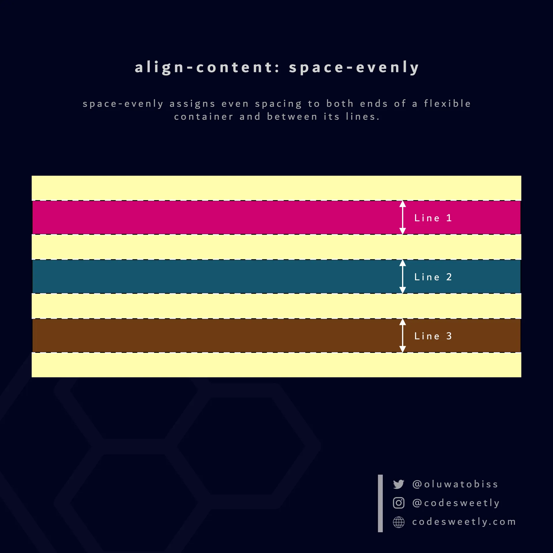
align-content’s space-evenly value ensures even spacing on both ends of a flexbox and between its lines
Here’s an example:
section {  display: flex;  flex-wrap: wrap;  align-content: space-evenly;  background-color: orange;  margin: 10px;  width: 90px;  height: 500px;}
div { border: 1px solid black; background-color: purple; color: white; width: 30px; height: 30px; padding: 10px; border-radius: 5px;}<section> <div>1</div> <div>2</div> <div>3</div> <div>4</div></section>We used the space-evenly value to assign even spacing to both ends of the flexbox and between its lines.